UX Research · UX Writing · Interaction Design · Design Integration

Registration &
MFA rollout

Reducing MFA drop-off from 22% to 4% through research, copy, and a theming layer that brought web views into the app.

UX Research UX Writing Interaction Design Design Integration 2024
22% → 4%
MFA drop-off rate
Solo
Research, copy, design, cross-functional lead
1 quarter
End to end
Before and after comparison of the MFA registration screens

We'd just been through an acquisition. The ask was straightforward: bring MFA setup into the app and make it work across both app and desktop. Simple enough on paper.

The product was an employee engagement platform used by companies of all sizes. The end users were employees, many of whom weren't particularly tech-savvy. For a lot of them, MFA was a completely new concept. They just wanted to check their work benefits, not configure authentication protocols.

Here's where it got interesting. The app had recently been overhauled with a new design system, but the web platform hadn't caught up yet. Still running the older green-and-white styling. So when the MFA flow was brought into the app, it dragged the web platform's UI in with it. Users would be moving through a clean, modern onboarding experience and then suddenly land on screens that looked like they belonged to a different product entirely. That jarring switch, combined with jargon-heavy copy, was driving a 22% drop-off rate.

I worked alongside a PM and an engineering lead. I handled research, copy, and design end to end.

Three screens showing the progression from native app UI to registration flow to the MFA web view

Three screens showing the progression from native app UI to registration flow to the MFA web view, highlighting the visual disconnect users experienced mid-registration.

The MFA flow had been untouched for a long time. The acquisition brought it back into focus (partly compliance, partly because a 22% drop-off rate is hard to ignore). When it landed with us, the first thing I did was pull up the existing screens and walk through them.

The problems were obvious. Immediately obvious. The copy was riddled with jargon that assumed technical knowledge the user base simply didn't have. "Time sensitive pass codes required for future authorisation." Right. Because that's exactly what someone thinks when they're trying to sign up for a discount scheme.

The QR code was being shown on mobile. On the same device users were supposed to scan it from. A dead end, hiding in plain sight.

And the visual styling? The web platform's older design system, sitting inside the app's shiny new UI like a mismatched puzzle piece. The whole thing felt like it had been bolted on rather than built in.

We didn't need research to know this needed fixing. We needed to fix it, and then test whether what we'd done actually worked.

With the review done, I redesigned the flow. Two layers of work, happening in parallel.

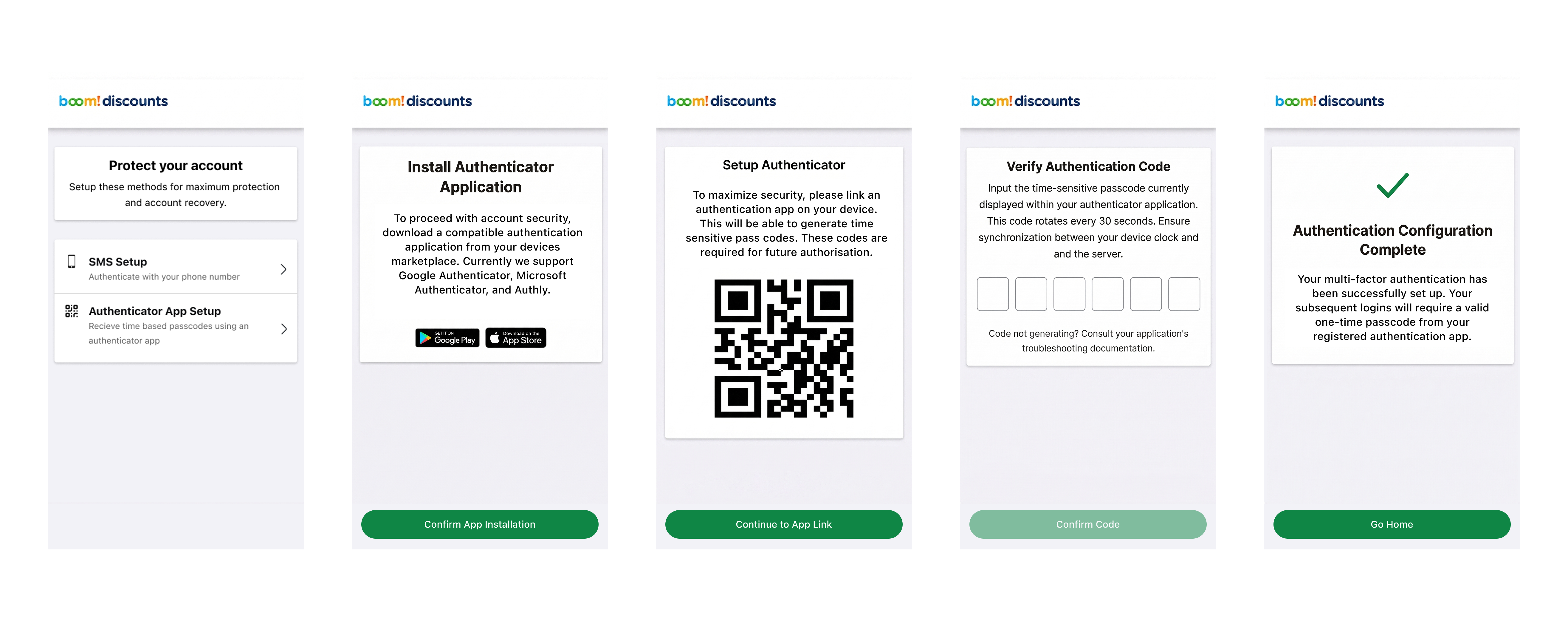
The copy. I rewrote everything. "Authenticator application" became named apps with icons (Google Authenticator, Microsoft Authenticator, Authy). A wall of jargon became three numbered steps. Lockout warnings became reassurance. Each screen told users what was happening and why it was safe.

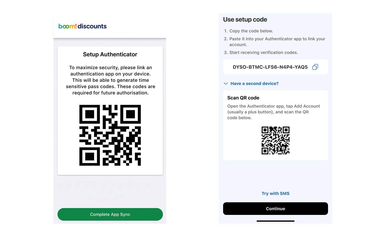
The QR code was the big one. Can't scan a QR code on the same device it's displayed on. So it went behind an accordion, replaced by a setup code as the default path. Still there for users with a second device, but no longer the first thing people saw and panicked about.

The theming layer. The web platform's green-and-white styling was replaced with the app's own design language. Same header pattern, same button styles, same spacing conventions. Users would no longer feel like they'd been kicked out of the app mid-registration.

And here's the thing about the theming layer: it wasn't a one-off fix. It gave us a foundation to converge the app and web UIs properly over time as the post-acquisition integration continued. Infrastructure work, disguised as product work.

Five old-style MFA screens in a horizontal row

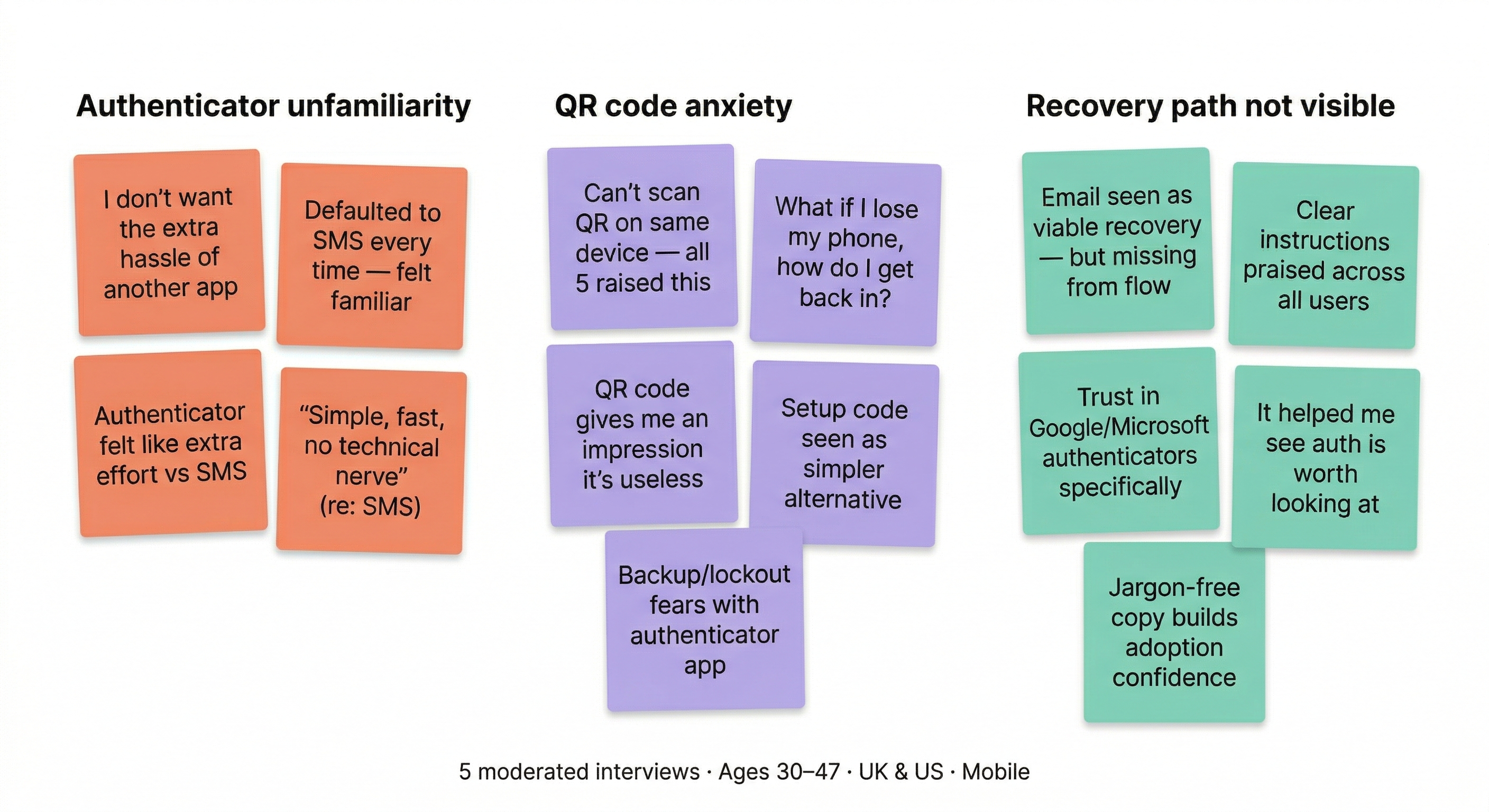
The old flow, screen by screen. Every step had its own friction.

  1. Users defaulted to SMS. "Authenticator app" was an unfamiliar term.
  2. Users didn't know what an authenticator app was or if they needed to download one.
  3. QR code can't be scanned on the same device. Consistently raised across interviews.
  4. Jargon-heavy error guidance increased anxiety rather than offering reassurance.
  5. Recovery info buried. Users didn't know how to regain access if they lost their device.

Install authenticator app: before and after

Two-up comparison of install step, old vs new

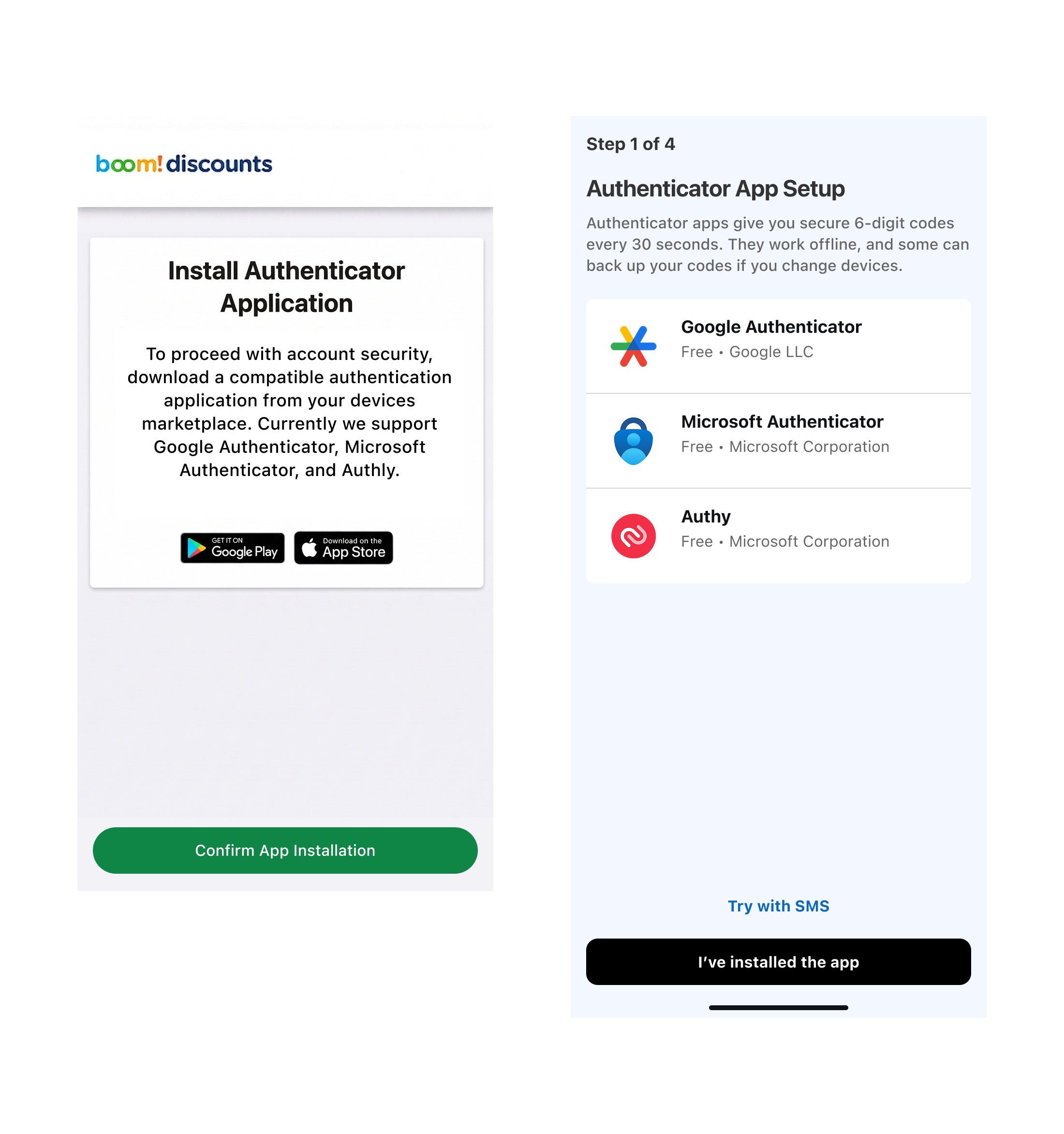
Named the apps, showed what to look for, removed marketplace jargon.

Setup code and QR: before and after

Three-up comparison of setup code step, old, new collapsed, new expanded

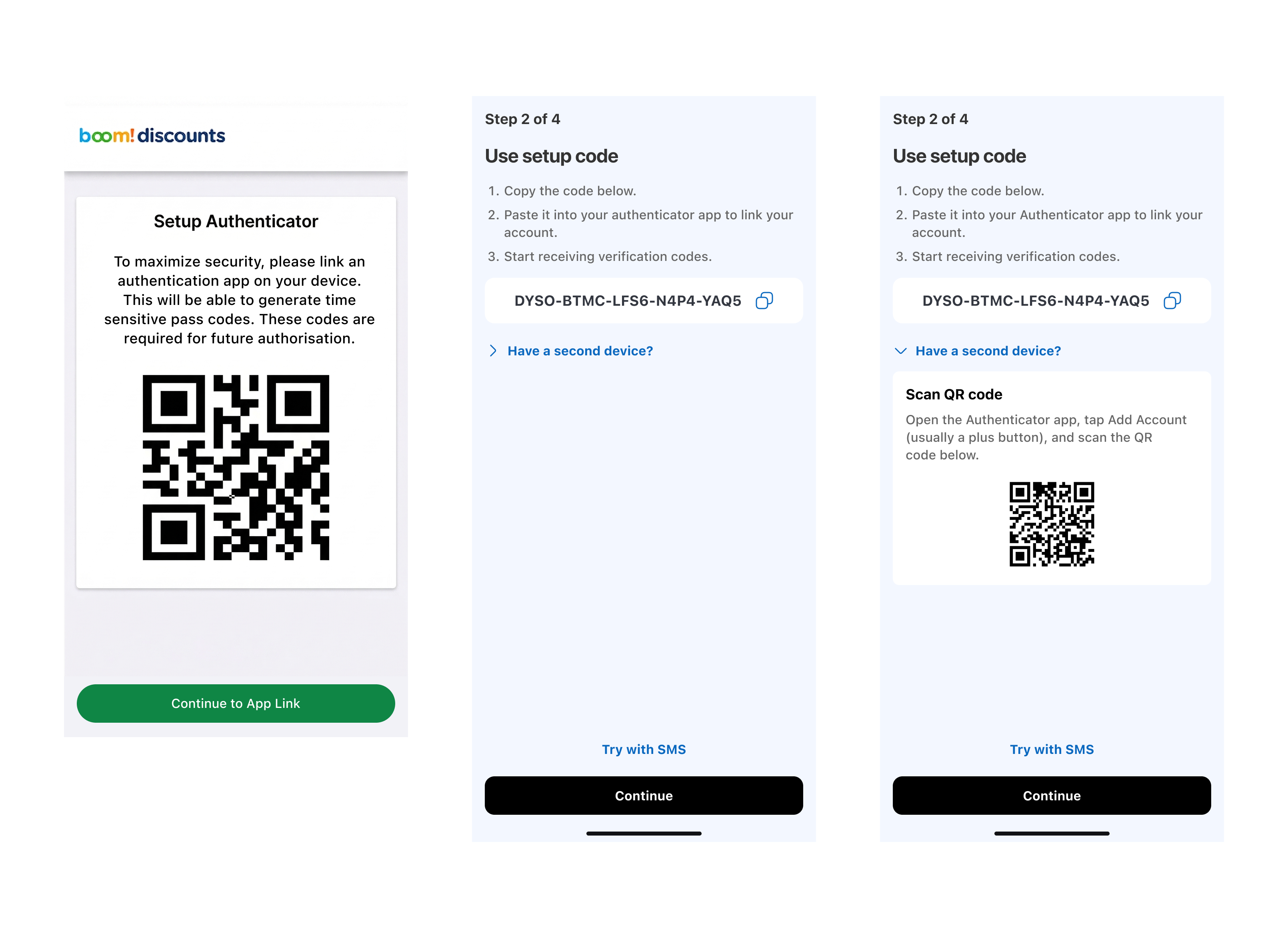
QR code moved behind an accordion. Visible for users with a second device, hidden for the majority who don't need it. Reduces friction without removing functionality.

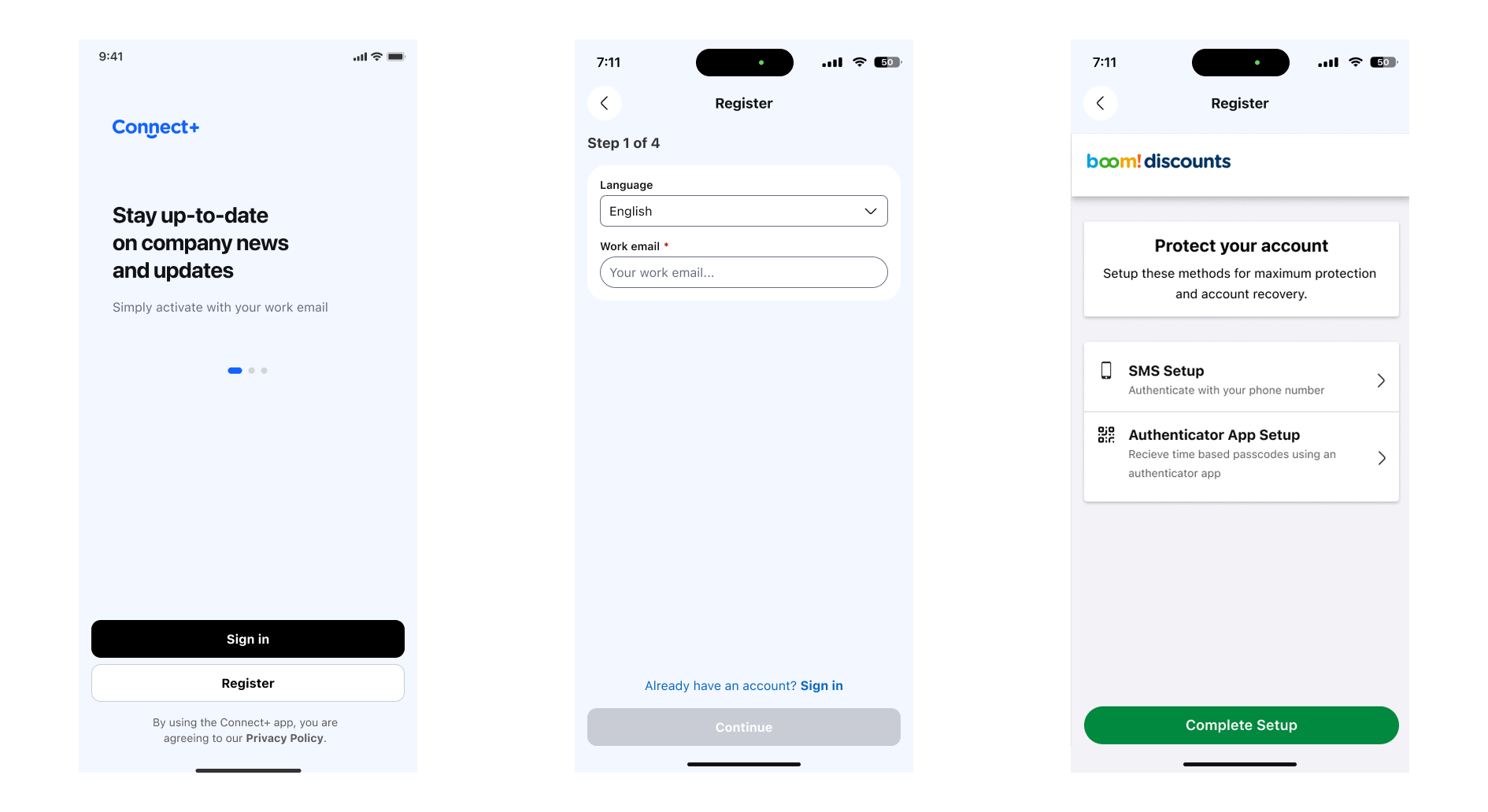
The theming layer in context

Three-up showing native app UI, old web view, new themed screen

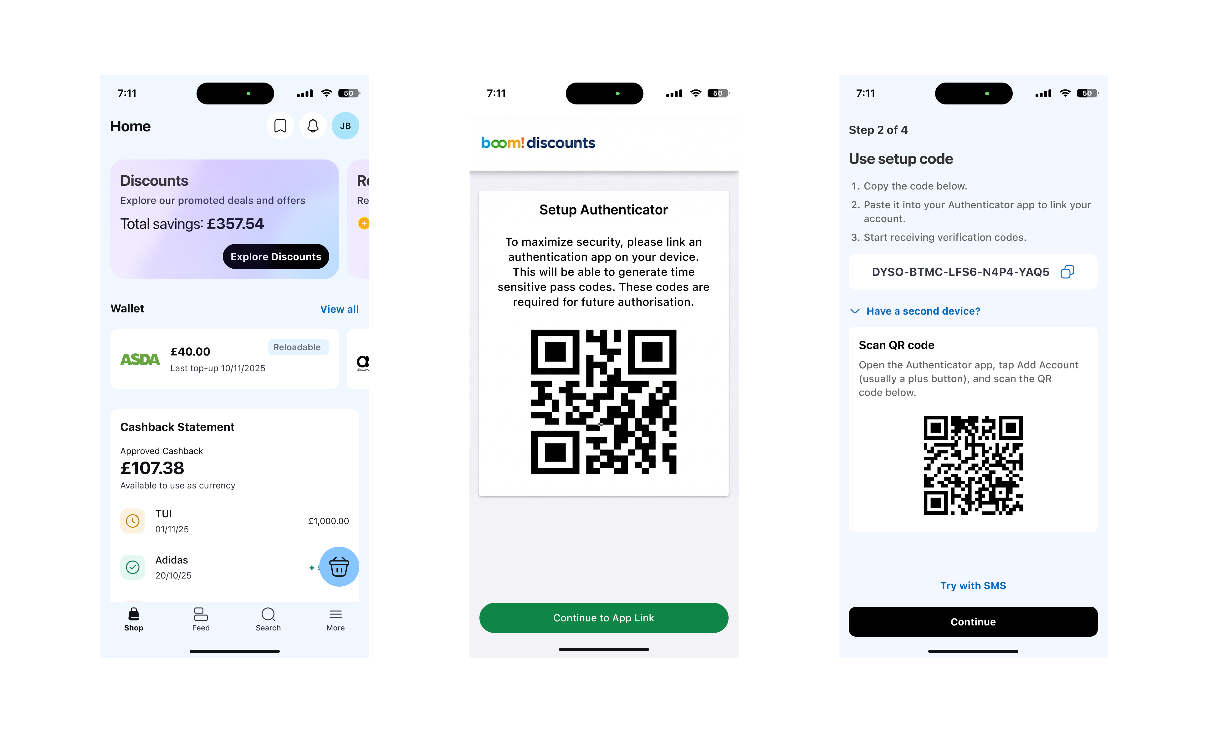
Native app UI alongside the old web view and the new themed version. The theming layer brought the MFA screens into visual alignment with the app's design language.

With the redesigned flow built, I ran five moderated user interviews to see if it held up. Remote sessions, with users who had no prior experience with authenticator apps. The PM joined live, the tech lead watched recordings afterwards.

We tested both the authenticator app setup and the SMS setup, comparing ease of use, comprehension, and how users felt about each method. The testing confirmed the direction, but it also surfaced things we hadn't anticipated.

Affinity map with three colour-coded clusters from research synthesis

Affinity map from the research synthesis. Three core themes emerged across all five interviews.

The rewrite landed well. Users found the language clear and the numbered steps easy to follow. But the sessions revealed something broader about how people feel about MFA, and that sharpened the design further.

SMS was the strong preference. Every participant gravitated toward it. Familiar, fast, no extra downloads. The authenticator app, even with clearer copy, still felt like extra effort. That's not something you can solve with words alone, but it's useful to know where the resistance sits.

Lockout anxiety was real. Users were worried about losing access if they lost their phone or deleted the app. The existing flow gave them nothing. No reassurance, no safety net, no acknowledgement that the fear was valid. We added a recovery line at the point of highest anxiety.

The QR code on mobile was confirmed as a dead end. All five participants raised it. The conditional logic fix we'd proposed (routing mobile users to the setup code instead) was validated as essential.

Clear instructions built confidence. The numbered steps and jargon-free language were praised across the board. Several participants noted that it made them feel more positive about authenticator apps as a concept, not just about this specific flow.

Security framing needed work. Users understood they had to set up MFA, but not why it mattered. We made additional copy changes post-testing to help users understand the upsides of MFA, not just the mechanics.

The underlying flow hadn't changed. The copy changed. The visual skin changed. And they changed in exactly the places the review identified and the research confirmed.

That gave leadership enough confidence to greenlight a full UK rollout. What started as a narrow brief to sort out a compliance requirement became a proof point for what design-led work can do within tight constraints.

22% → 4%
MFA drop-off rate
82% improvement

Research earned the engineering spend. When we pushed for the QR code conditional logic fix (which added dev time nobody had budgeted for), we had five interviews backing it up. Knowing when to fight for something, and having the receipts to support it, is part of the job.

The theming layer felt like a distraction at first. It wasn't. It solved the immediate visual disconnect and laid groundwork for the post-acquisition UI convergence. That kind of work (infrastructure done in the context of a real product problem) is some of the most durable work you can do.

And the sequence mattered. We didn't research first and then design. We reviewed, designed, and then validated. The research didn't tell us what to build. It confirmed we were right and showed us what we'd missed. Sometimes the instinct comes first. The evidence comes second. And both matter.